BOING! BOTTLE REDESIGN
The aim of this project was to take an existing brand of beverages and design a variety pack while also taking the existing branding in a different direction. My goal was to create an image for Boing! that could appeal to a broader U.S market that would include customers between the ages of 14–30 years old. A solid graphic language and a simple yet iconic mascot would make the brand stand out on the shelf.

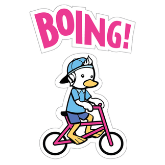
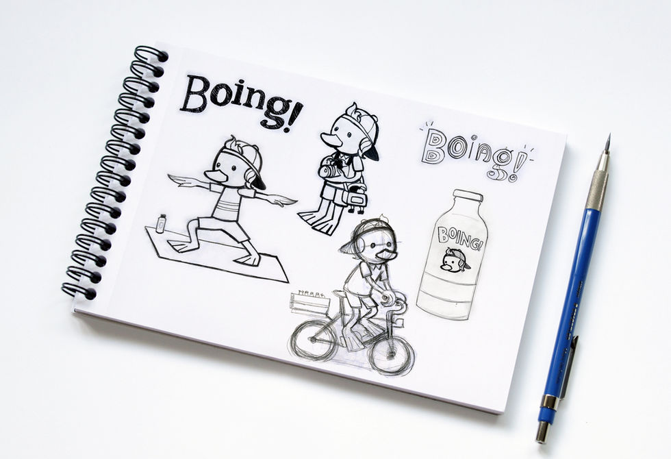
I drew inspiration from images in artisanal Mexican crafts while combining them with the duck mascot that’s not unlike a Sanrio character. The reimagined Pato Pascual mascot is based on the current mascot, which at first was just a cutout of Donald Duck. After some lawsuits, over time the duck known as Pascual morphed into a more generic-looking athletic character. I didn’t think that the mascot was designed to be memorable, nor was it utilized as the face of the brand. However, I decided to take the mascot in a direction in which the targeted age group could relate to him as a character, by featuring him participating in various activities that are popular among Millenials.

In addition to the bottles and carrier, I also created promotional items featuring the Pato Pascual icon for a hypothetical trade show booth. I designed Pascual to be a malleable mascot, so I was pleased to be able to use him for a variety of products. The t-shirt is very wearable outside of a promotional context because of the cute appeal of the icon. As for the mug, tin cups are very popular in Mexico among Millenials since they’re considered retro, so I decided to create an item that ties the product back to its homeland’s roots while keeping it contemporary.

DEVELOPMENT PROCESS


